


London 2012 Logo: Retro Ugly Is In

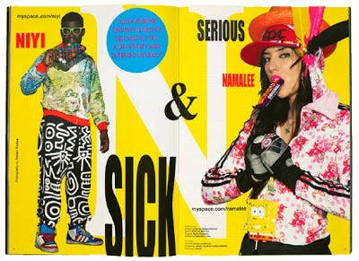
image from CR
Creative Review got it right with The New Ugly. Ugly is back or on its way back really. "Stretched type, day-glo colours and a flagrant disregard for the rules." One might remember it from the late 80's and the MC Hammer pants.
The London 2012 logo, well, it's just that. For 2012. I have a gut feeling that by 2012 the logo will seem less "ugly" and more "hip". This is a definite way to keep a logo from becoming dated. Preempt the culture curve and design for the future. If Wolff Olins designed a logo for 'today', it would most likely be dated by the time the Olympics rolled around.
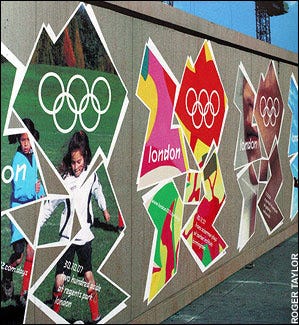
The concept is quite innovative as well. Using the image to mask other various images and patterns. Each venue will have its own theme with in the shape of the logo, and also sponsors will have their own colour pallets to match their own identities.
They decided to reveal the first of what they call the "freefill" logos early to help convince the public of the growth, and show how it will continue to evolve over the years. I say well done because once I saw the Lloyd's TSB sponsorship logo, I liked it more already.
image fromtelegraph.co.uk
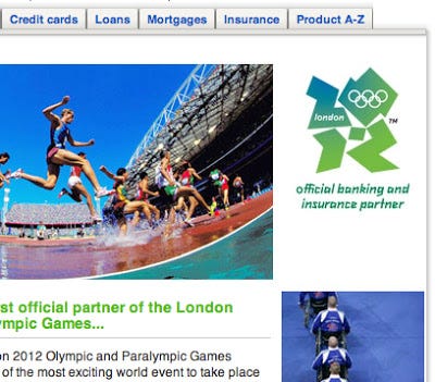
image from lloydstsb.com